
Octave practice :: Plotting Data
- Soojin Woo

- 2020년 4월 30일
- 1분 분량
Contents in the post based on the free Coursera Machine Learning course, taught by Andrew Ng.
1. define a matrix
>> t = [0:0.01:0.98];
2. plot
>> y1 = sin(2*pi*4*t)
>> plot(t,y1);
>> y2 = cos(2*pi*4*t)
>> plot(t,y2);
3. hold on
>> plot(t,y1);
>> hold on;
>> plot(t,y2);
3.1 How to apply assigned color
>> plot(t, y1,'g');
>> hold on;
>> plot(t,y2,'y');
4. label

4.1 xlabel
>> xlabel('time')
4.2 ylabel
>> ylabel('value')
5. legend
>> legend('sin', 'cos')
6. title
>> title('my plot')
7. save
>> print -dpng 'myPlot.png'
8. figure
>> figure(1); plot(t,y1);
>> figure(2); plot(t,y2);
9. subplot
>> subplot(1,2,1);
>> plot(t,y1);
>> subplot(1,2,2);
>> plot(t,y2);
9.1 In the case of using subplot(1,2,2) first. (<-> Above we applied subplot(1,2,1) first)
>> subplot(1,2,2);
10. axis
>> axis([0.5 1 -1 1])
11. clf

12. imagesc
12.1 magic
>> A=magic(5)
12.2 imagesc
>> imagesc(A)
12.3 colorbar & colormap
>> imagesc(A), colorbar, colormap gray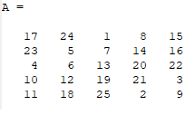


- You could compare colormap to matrix A. It shows that a smaller number is related to a darker color on the map. - For example, Look at A(1,3) = 1. And we can verify that it matches with one of the darkest parts.

13. Comma VS Semicolon
>> a=1, b=2, c=3
a = 1
b = 2
c = 3
>> a=1;b=2;c=3;
>>- By using 'Comma' you can carry out multiple commands simultaneously.


댓글